Analytics Now Starts With Whether Your Mail Arrived
The analytics page is now one page built around your delivery rate, what changed since the last period, and which domain or tag is behind it.
The old analytics page had three tabs and a lot of numbers, and none of them answered the question people open it to answer: is my mail arriving, and is that better or worse than before?
The new page starts with that answer, and it all fits on a single page without tabs.
One number first, and what it is compared with#
At the top is your delivery rate for the period, next to how much it moved against the period before. Under it, one sentence says what the number is made of: how many sends reached an outcome, and how many are still waiting to be sent or retried. Mail still on its way is counted separately, so a busy afternoon does not drag your rate down for an hour and then quietly fix itself.
To the right is a ledger of every outcome: delivered, bounced, failed, not sent, complaints, opened, clicked, unsubscribed. Each line has its count, its rate and its change, coloured by whether the change is good news or bad.
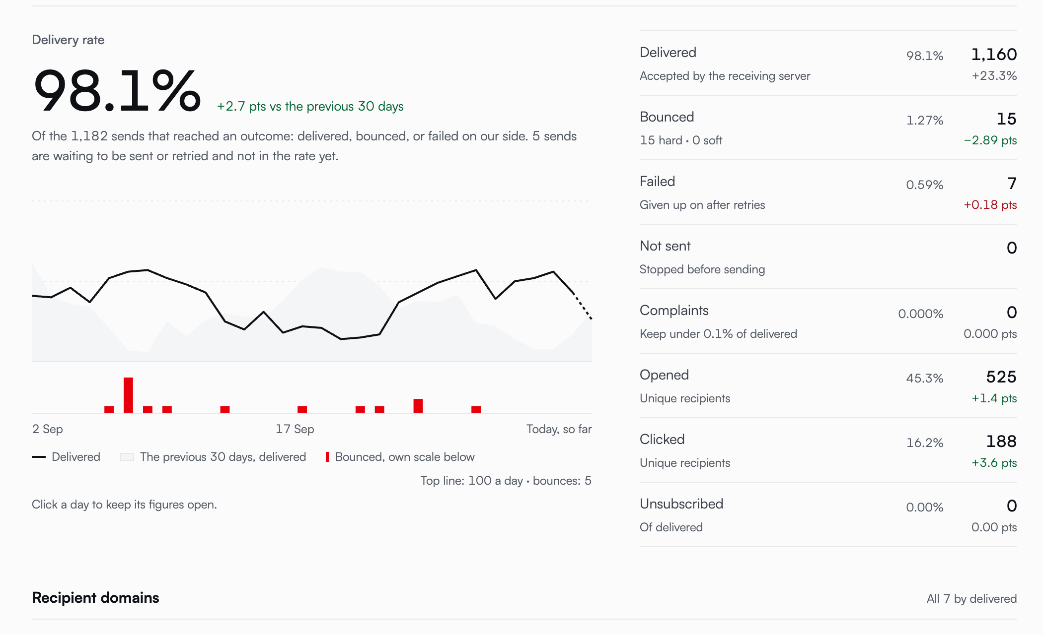
The chart shows delivered mail per day against the previous period in grey, with bounces on their own scale underneath so a handful of them stays visible. Click a day and its figures stay open; click through and you get that day's emails.
Where a problem lives#
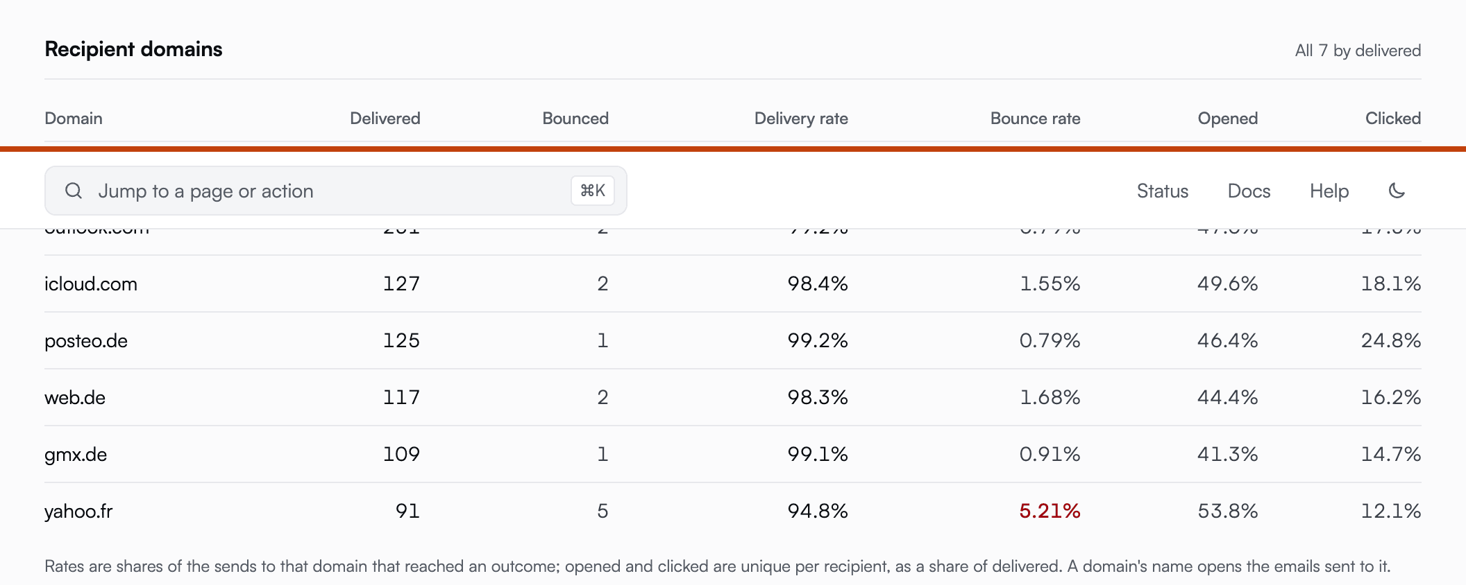
An overall rate can look fine while one mailbox provider is turning you away. So recipient domains get their own rows, each with its delivery rate, bounce rate, opens and clicks. A bounce rate worth watching is marked in amber, and one that needs attention now in red. Click a domain and you see exactly the emails sent to it, CC and BCC copies included.
Which mail people act on#
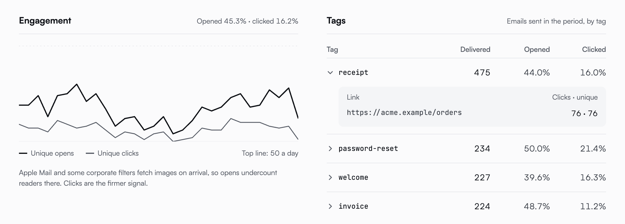
Engagement shows unique opens and clicks per day. Opens undercount, and the page says so: Apple Mail and some corporate filters fetch images on arrival, so clicks are the firmer signal.
If you tag your sends, each tag gets its own row, and opening a tag lists the links people clicked in those emails. Links are shown without their query strings, because those often carry a token belonging to one recipient.
Small things that were wrong before#
- Pick any date range, not just 7, 30 or 90 days.
- A quiet period no longer shows a wall of zeros. It tells you when your last send was and offers a range that includes it.
- If a figure cannot be loaded, the page says so instead of showing zero. A zero that really means "we don't know" is worse than no number.
- Every recipient counts, CC and BCC included, and the rates use that same unit throughout.
The table with one row per day is still at the bottom, and so is the CSV export.
You'll find the page under Analytics in your dashboard. The analytics guide explains how each rate is counted and how to get the same figures from the API.
Start sending GDPR-compliant email today
Create a free account and send your first email in minutes. Email storage and AI processing in Finland, with a DPA on every plan.