A New Dashboard That Answers the First Question First
The euromail dashboard has a new overview, nine sections instead of twenty-seven links, a search that finds pages by what they are about, and bounced emails that explain themselves.
When you open an email platform's dashboard, you almost always want to know one thing first: is my mail arriving? Our old overview made you work that out. It had a sent counter for the month, a delivered and a bounced count, a complaint count for the last day, and a block of inbound numbers, each measured over a different stretch of time.
Two of the numbers were also wrong, and it took me too long to notice. Delivered and bounced were counted from your ten most recent emails, so an account that had sent a few thousand messages this month saw "Delivered 9, Bounced 1" next to its monthly total. Worse, the delivery rate on the Analytics page and in the API read 100% for every account, however much of its mail bounced. Both are fixed. Bounces and failed sends now count against the rate, so if yours looks lower now, that is why. The new number is the true one.
The overview now leads with the answer#
The first thing on the page is your delivery rate over the last 30 days, in large type, with a chart of what you sent and what arrived each day. Bounces show up as small red marks along the bottom, so a bad day stands out without a second chart. Today is drawn as a dashed line, because it is still being counted, and a normal morning should not look like a collapse.
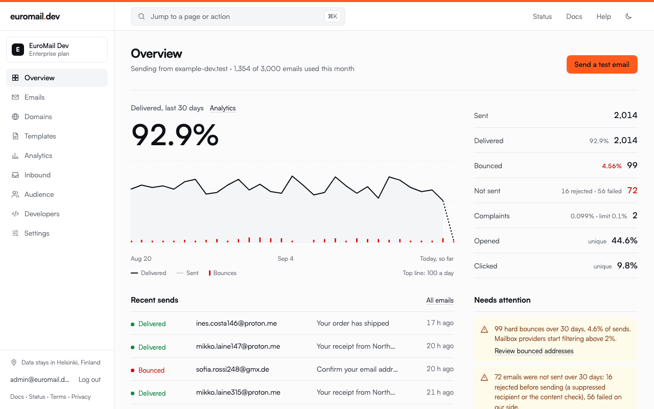
Next to the chart is a short list covering the same 30 days: sent, delivered, bounced, not sent, complaints, opens and clicks. "Not sent" is mail that never left, either because we stopped it (a suppressed address, say) or because it failed on our side. Complaints are shown against the 0.1% that Gmail and Yahoo ask bulk senders to stay under.
Below that, a "Needs attention" panel tells you when something is off. That could be hard bounces above 2%, complaints near the limit, mail that was rejected before sending, inbound mail your routes could not accept, or a domain that is not verified yet. When everything is fine it says so. When a number could not be read, it says that too, instead of guessing.
Nine sections instead of twenty-seven links#
The sidebar had grown to 27 links in six groups, and on a laptop screen Settings and Billing sat below the fold. It now has nine sections: Overview, Emails, Domains, Templates, Analytics, Inbound, Audience, Developers and Settings. Pages that used to be neighbours in the sidebar are now tabs across the top of their section. Deliverability, weekly insights and DMARC reports live under Analytics, for example, and API keys and webhooks under Developers. Every page kept its address, so bookmarks still work.
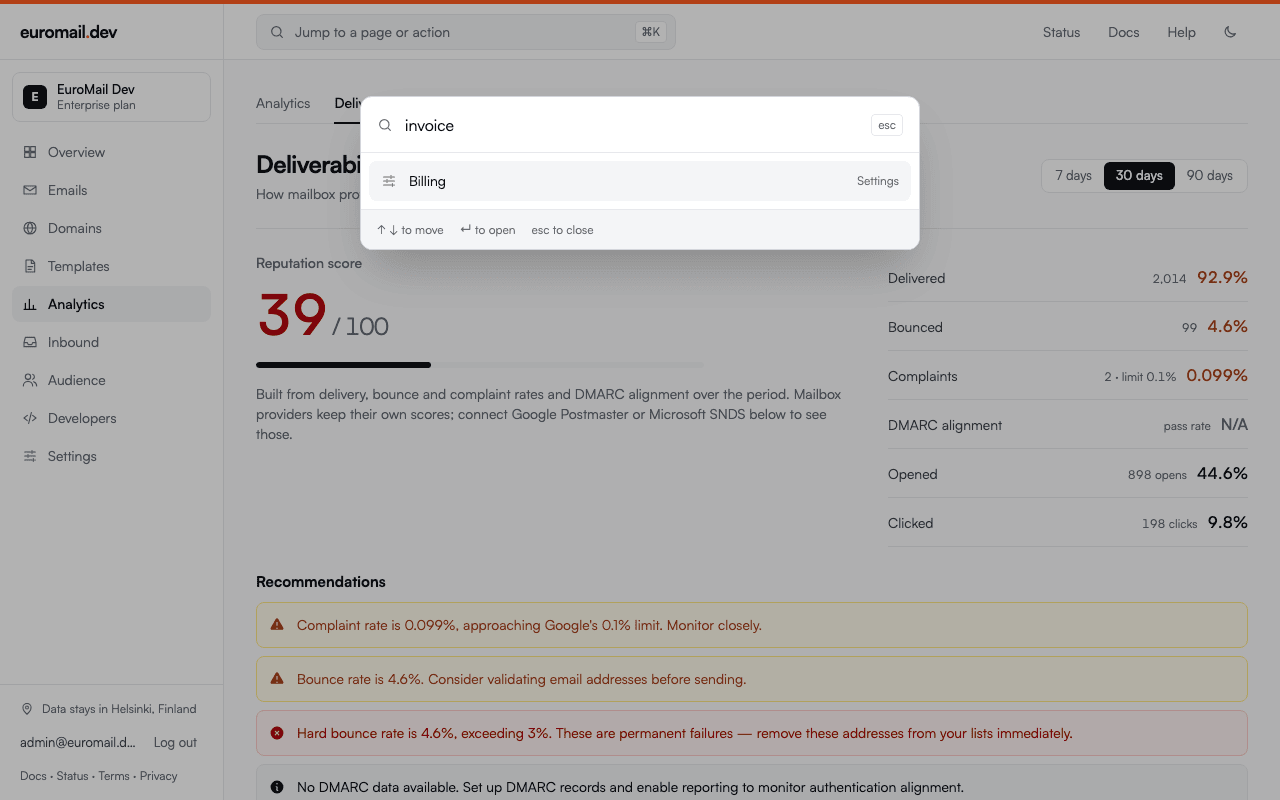
You can also skip the sidebar entirely. Press ⌘K (Ctrl+K on Windows and Linux) on any page and type what you are looking for. It understands what pages are about, not only their names: "bounce" offers Emails, Suppressions and Deliverability, and "invoice" takes you to Billing.
A bounced email explains itself#
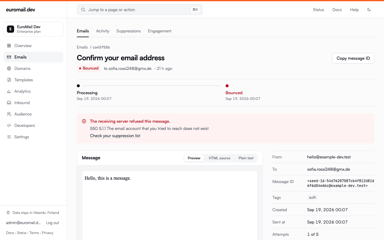
Open an email and its subject is now the title of the page, with its delivery status and recipient right under it. Each step the message went through runs across the top with its time, ending in delivered or refused. If the receiving server refused it, you see why in plain words above the message, with the server's own reply beside it.
The Activity feed got the same treatment. Each event used to show a long internal ID for its email. Now it shows who the email was to and what it was about, so you can scan a morning's bounces without opening each one.
Easier on the eyes, day and night#
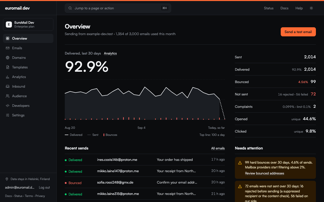
The dashboard looks quieter now. It is mostly white and near-black, and our orange is saved for the one action that moves you forward on each page. I redid dark mode too, charts included. A few screens used to show white boxes or unreadable buttons in the dark, and those are gone.
Where to find it#
All of this is live in the dashboard now, and there is nothing to turn on. The dashboard guide walks through the sections, and if something reads wrong or you cannot find a page you used to use, press Help in the top bar and tell us.
Start sending GDPR-compliant email today
Create a free account and send your first email in minutes. Email storage and AI processing in Finland, with a DPA on every plan.